Working with lots of point data

This is a tutorial for visualizing and exploring massive amounts of location data.
I am stubborn when it comes to geographic data. I believe that data should be visualized and analysed at the scale it is collected at. However, often the data overwhelms the processing capabilities of scientists. With a wealth earth observing satellites, envirnmental sensors, and tools such as LiDAR, scientists often have more data than they know what to do with. Outside of academia, location data can be even more massive, such cell phone location data. This stubborness is why I get excited when I come across tools that let me interact with data at the scale it was actually collected at- tools like dataShader.
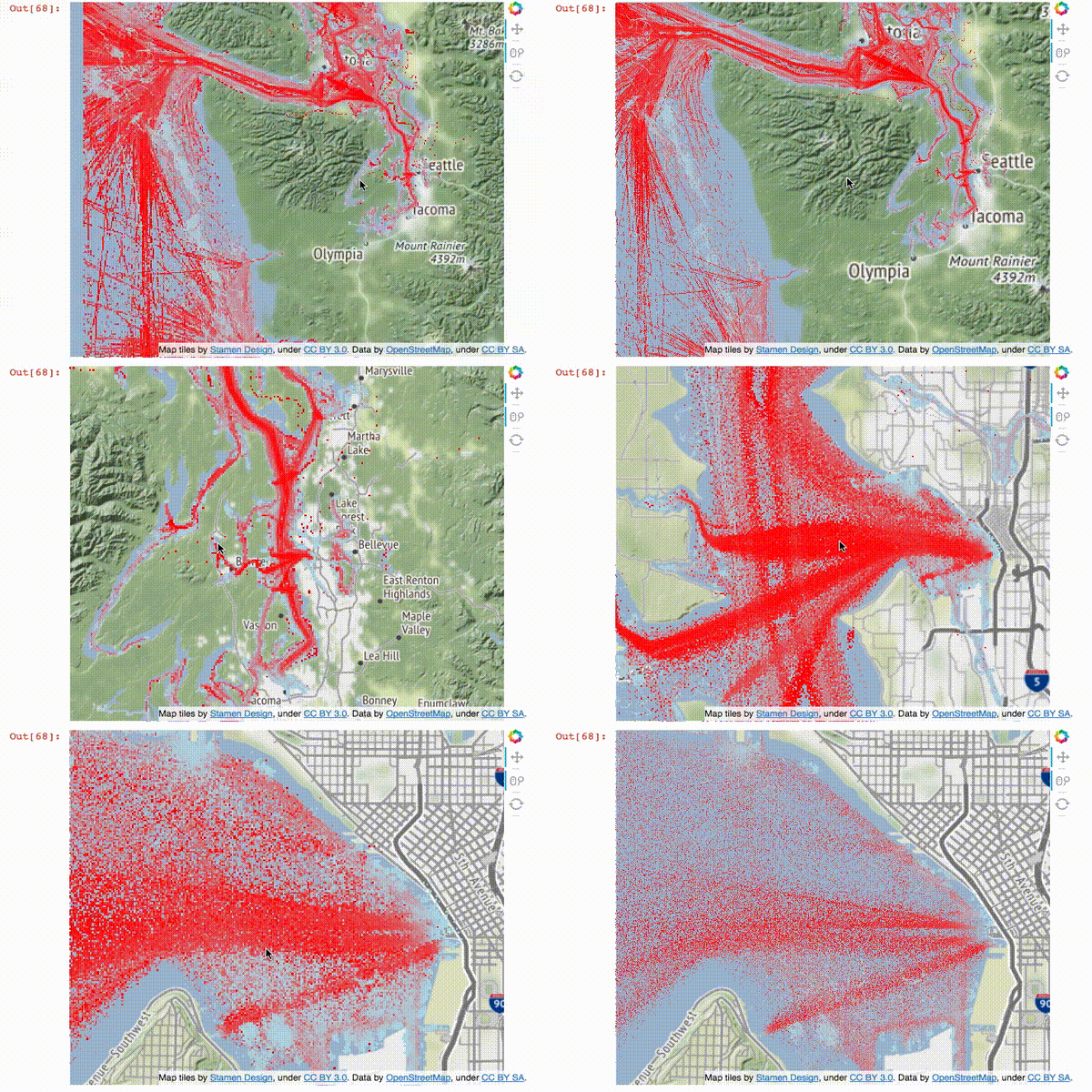
To explore this type of data, I am using marine AIS vessel location data, from the U.S. Coast Guard. I came across it when I was exploring a very basic question - where should I go kayaking if I don’t want to get run over or massively waked out by marine traffic in Puget Sound?
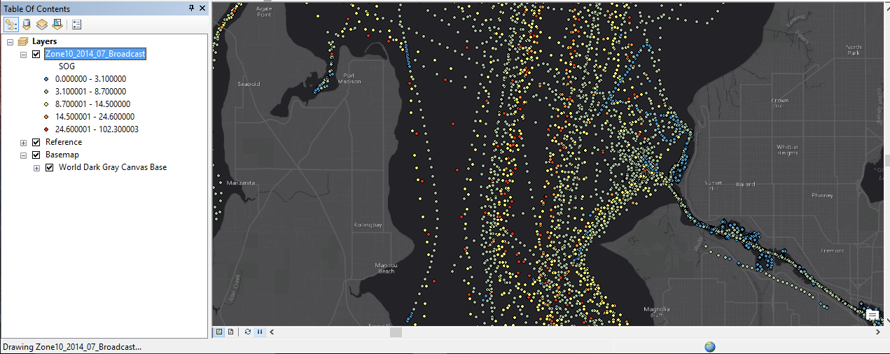
This data is perhaps not truely ‘big’, but one month takes up about 800 mb when zipped, and it takes arcGIS a long time to load (which might be a working definition of big data for GIS folks.) It represents about 23 million point locations.
Convert data into a better format
The data was donwloaed from marinecadastre.gov. It is formatted as .gdb. Step one is to convert it to something more flexible. To do so, I use the built in tools QGIS has take a .gdb and save it both a .csv and and .geoJson. These files are big, but they are a start.
| data type | size (GB) |
|---|---|
| ucompressed GDB | 2.65 |
| CSV | 2.35 |
| geoJSON | 7.95 |
The old way

As I said at the start, the standard way to handle this data is to plot your program in a [geographic information system] (https://en.wikipedia.org/wiki/Geographic_information_system) such as arcGIS. This route is painful and makes the data very hard to quickly explore. Each data point is individually drawn. If you move the area of interest even a little bit, ArcGIS trys to re-draw everything again. QGIS is a little better (it draws the points much more quickly - but suffers from the same issues. Enter Bokeh and DataShader.
The new way
First, you need to install bokeh and datashader, then import them
import pandas as pd
import numpy as np
from pyproj import Proj, transform

import datashader as ds
from datashader import transfer_functions as tf
from datashader.bokeh_ext import InteractiveImage
from datashader.utils import export_image
from datashader.colors import colormap_select, Greys9, Hot, viridis, inferno

from IPython.core.display import HTML, display

from bokeh.plotting import figure, output_notebook, output_file, show
from bokeh.tile_providers import STAMEN_TERRAIN
from bokeh.tile_providers import STAMEN_TONER
from bokeh.embed import file_html

from functools import partial

output_notebook()
Import data
# CSV is much quicker in this case than geojson
df = pd.read_csv('Zone10_2014_07.csv')
Re-project
You can use dataShader and Bokeh with any type of point data you want. It does not need to be geographically aware. But to put it in context, it is helpful to plot it on a basemap. In our case - the basemap needs point data in a web mercator projection.
## Datashader needs the location in web mercator coordiates

# WGS 84
inProj = Proj(init='epsg:4326')

# Web mercator
outProj = Proj(init='epsg:3857')

df['xWeb'],df['yWeb'] = transform(inProj,outProj,df['X'].values,df['Y'].values)
We use pyproj and Pandas to transform the coordinate data.
Working with time slices
The direct import of the csv to pandas does not handle the data information correctly, so I correct it here. You can also slice the data to within a smaller date and time window if you like.
# set baseDateTime to a proper pandas datetime
df['BaseDateTime'] = pd.to_datetime(df['BaseDateTime'])

# select a slice of data you want to visualize

df_slice = df[(df['BaseDateTime'] > '2014-07-01') & (df['BaseDateTime'] < '2014-07-30')]
now the meaty part
WA = x_range, y_range = ((df_slice.xWeb.min(),df_slice.xWeb.max()), (4898057.594904038,5565974.539663678))

plot_width  = int(600)
plot_height = int(plot_width//1.2)

def base_plot(tools='pan,wheel_zoom,reset',plot_width=plot_width, plot_height=plot_height, **plot_args):
    p = figure(tools=tools, plot_width=plot_width, plot_height=plot_height,
        x_range=x_range, y_range=y_range, outline_line_color=None,
        min_border=0, min_border_left=0, min_border_right=0,
        min_border_top=0, min_border_bottom=0, **plot_args)

    p.axis.visible = False
    p.xgrid.grid_line_color = None
    p.ygrid.grid_line_color = None
    return p

options = dict(line_color=None, fill_color='blue', size=5)

background = "black"
export = partial(export_image, export_path="export", background=background)
cm = partial(colormap_select, reverse=(background=="black"))

def create_image(x_range, y_range, w=plot_width, h=plot_height):
    cvs = ds.Canvas(plot_width=w, plot_height=h, x_range=x_range, y_range=y_range)
    agg = cvs.points(df_slice, 'xWeb', 'yWeb',ds.mean('SOG'))

    img = tf.shade(agg, cmap=['lightblue','red'], how='eq_hist')

    #img = tf.shade(agg, cmap=Hot, how='eq_hist')
    return tf.dynspread(img, threshold=0.5, max_px=4)

p = base_plot()
p.add_tile(STAMEN_TERRAIN)
And finally the magic
# this export step is not neccesary - it saves a PNG of the file
export(create_image(*WA),"WA_red")

# this is where the magic happens
InteractiveImage(p, create_image)
This is a little hard to convey in a blog post without a interactive notebook, but I hope the gif shows a little of the potential. As this tutorial progresses I will put up an interactive version of the iPython notebook.
